How to implement material spinner in Angular?; In this tutorial, we will learn how to implement a spinner with the Angular Material library, We will use the MatProgressSpinnerModule material modules to show a spinner and spinner progress bar some other important configurations.
We will use <mat-progress-spinner> and <mat-spinner> directive of MatProgressSpinnerModule, <mat-progress-spinner> and <mat-spinner> are circular indicators of progress and activity.
You can download the working example https://github.com/technostuf/angular-material-spinner-example
- Create a new Angular app
- Install Angular Material Library
- Import the modules
- Add code in the view file
- Run an Angular application
Create a new Angular 12 app
The first step is to open your terminal and execute the below command to create a new Angular app. just copy the below command and paste in terminal
ng new angular-material-tabsInstall Angular Material Library
To install the Angular Material Library in the Angular application using the below command
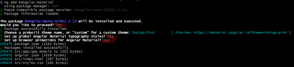
ng add @angular/materialAfter running the above command, it will ask you to choose a material theme and choose the CSS style method.
I choose an indigo-pink theme and we also need to import the theme CSS into our main style.css
/* You can add global styles to this file, and also import other style files */

html, body { height: 100%; }
body { margin: 0; font-family: Roboto, "Helvetica Neue", sans-serif; }
@import "~@angular/material/prebuilt-themes/indigo-pink.css";
Import the modules
In this step, we’ll import MatProgressSpinnerModule and MatCardModulethe in app.module.ts file to make available thought out the project, MatProgressSpinnerModule module is used to show a spinner in our angular application. MatCardModulethe imports for design HTML view.
import { NgModule } from '@angular/core';
import { BrowserModule } from '@angular/platform-browser';

import { AppRoutingModule } from './app-routing.module';
import { AppComponent } from './app.component';
import { BrowserAnimationsModule } from '@angular/platform-browser/animations';
import { MatProgressSpinnerModule } from '@angular/material/progress-spinner';
import { MatCardModule } from '@angular/material/card';

@NgModule({
  declarations: [
    AppComponent
  ],
  imports: [
    BrowserModule,
    AppRoutingModule,
    BrowserAnimationsModule,
    MatProgressSpinnerModule,
    MatCardModule

  ],
  providers: [],
  bootstrap: [AppComponent]
})
export class AppModule { }
Add code in the view file
Open the src\app\app.component.html file and add the below code to show a spinner.
<mat-card>
  <mat-card-content>
    <h2>Progress spinner</h2>
    <section class="section">
      <label>Color: warn</label>
      <mat-spinner color="warn"></mat-spinner>
    </section>
    <section class="section">
      <label>Color: primary</label>
      <mat-spinner color="primary"></mat-spinner>
    </section>
    <section class="section">
      <label>Color: accent</label>
      <mat-spinner color="accent"></mat-spinner>
    </section>
  </mat-card-content>
</mat-card>

<mat-card>
  <mat-card-content>
    <h2>Progress bar</h2>
    <section class="section">
      <mat-progress-spinner mode="determinate" value='66'></mat-progress-spinner>
    </section>

    <section class="section">
      <label>Change progress bar size</label>
      <mat-progress-spinner mode="determinate" value='66' diameter="45"></mat-progress-spinner>
    </section>
  </mat-card-content>
</mat-card>
Directive options
[color] – Color of the Spinner loader, Spinner supports the three colors ‘primary’, ‘accent’, ‘warn’, by default spinner uses the primary color.
[mode] – The Spinner can be used as a loader or progress indicator in percentages 0 to 100, The spinner supports two modes, “determinate” and “indeterminate”, determinate for the show progress loader and indeterminate for the show a loader spinner.
[value] – if we use mode determinate then we pass the value as a percentage to show progress.
Run an Angular 12 application
Execute the following command on the terminal and run the angular app.
ng serveOutput

You can download the working example of the Angular material spinner Tutorial
https://github.com/technostuf/angular-material-spinner-example
Related Post
- How to use material chips(tags) in Angular?
- How to implement material spinner in Angular?
- Angular 12 autocomplete with API Data
- Angular 12 TinyMCE integration with an example
- Angular 12 Material Tabs Tutorial with Example
- Angular 12 Material Autocomplete Example
- Angular 12 Material Dialog Example
- How to bind HTML inside the angular binding?
- Angular 12 Bootstrap Responsive Carousel slider
- Angular 12 modal popup example with Bootstrap 4