React bootstrap is a component-based library that provides bootstrap features as react components, Today, We will learn how to integrate the react bootstrap alert component in react applications.
You can download/clone the working example https://github.com/technostuf/react-bootstrap-alert-demo
- Create a React application
- Install react-bootstrap library
- Add code to the file
- Run a React application
Create a React application
Create a React app using the below command. Open your terminal and move to your project folder and run the below command.
npx create-react-app react-bootstrap-alert-demoThe above command will create a new folder with the app name so you need to move into that folder, use the below command to change the directory.
cd react-bootstrap-alert-demoInstall react-bootstrap library
After creating react app we need to install react-bootstrap and bootstrap from npm or yarn. the following command will install react-bootstrap and bootstrap package into the application. if you have already installed then skip it.
 npm install --save react-bootstrap bootstrap
 OR using yarn
 yarn add react-bootstrap bootstrap
Add code to the file
Create a component file AlertComponent.js to hold all types of alert code, then we need to import it into App.js.
import React, { useState } from "react";
import 'bootstrap/dist/css/bootstrap.css';
import { Alert, Button } from "react-bootstrap";
const AlertComponent = () => {
const [show, setShow] = useState(true);
return (
<div>
<div class="row d-flex justify-content-center text-center">
<h1>React bootstrap alert notification - technostuf.com</h1>
<hr />
<div className="col-md-8">
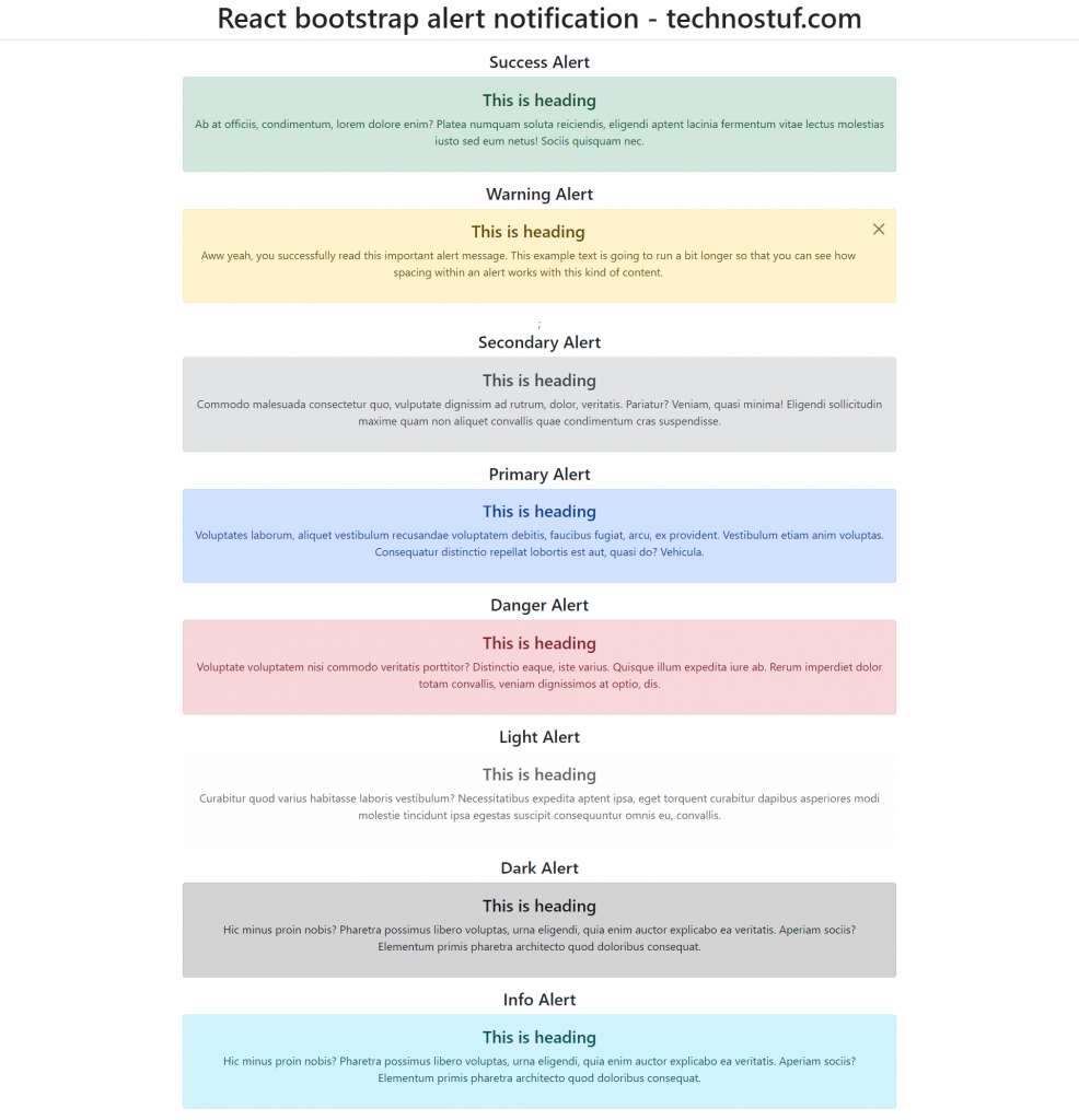
<h4>Success Alert</h4>
<Alert variant="success">
<Alert.Heading>This is heading</Alert.Heading>
<p>
Ab at officiis, condimentum, lorem dolore enim? Platea numquam soluta reiciendis, eligendi aptent lacinia fermentum vitae lectus molestias iusto sed eum netus! Sociis quisquam nec.
</p>
</Alert>
</div>
<div className="col-md-8">
{show ? (
<>
<h4>Warning Alert</h4>
<Alert variant="warning" onClose={() => setShow(false)} dismissible>
<Alert.Heading>This is heading</Alert.Heading>
<p>
Aww yeah, you successfully read this important alert message. This example
text is going to run a bit longer so that you can see how spacing within an
alert works with this kind of content.
</p>
</Alert>
</>
) : (
<Button onClick={() => setShow(true)}>Show Alert</Button>
)};
</div>
<div className="col-md-8">
<h4>Secondary Alert</h4>
<Alert variant="secondary">
<Alert.Heading>This is heading</Alert.Heading>
<p>
Commodo malesuada consectetur quo, vulputate dignissim ad rutrum, dolor, veritatis. Pariatur? Veniam, quasi minima! Eligendi sollicitudin maxime quam non aliquet convallis quae condimentum cras suspendisse.
</p>
</Alert>
</div>
<div className="col-md-8">
<h4>Primary Alert</h4>
<Alert variant="primary">
<Alert.Heading>This is heading</Alert.Heading>
<p>
Voluptates laborum, aliquet vestibulum recusandae voluptatem debitis, faucibus fugiat, arcu, ex provident. Vestibulum etiam anim voluptas. Consequatur distinctio repellat lobortis est aut, quasi do? Vehicula.
</p>
</Alert>
</div>
<div className="col-md-8">
<h4>Danger Alert</h4>
<Alert variant="danger">
<Alert.Heading>This is heading</Alert.Heading>
<p>
Voluptate voluptatem nisi commodo veritatis porttitor? Distinctio eaque, iste varius. Quisque illum expedita iure ab. Rerum imperdiet dolor totam convallis, veniam dignissimos at optio, dis.
</p>
</Alert>
</div>
<div className="col-md-8">
<h4>Light Alert</h4>
<Alert variant="light">
<Alert.Heading>This is heading</Alert.Heading>
<p>
Curabitur quod varius habitasse laboris vestibulum? Necessitatibus expedita aptent ipsa, eget torquent curabitur dapibus asperiores modi molestie tincidunt ipsa egestas suscipit consequuntur omnis eu, convallis.
</p>
</Alert>
</div>
<div className="col-md-8">
<h4>Dark Alert</h4>
<Alert variant="dark">
<Alert.Heading>This is heading</Alert.Heading>
<p>
Hic minus proin nobis? Pharetra possimus libero voluptas, urna eligendi, quia enim auctor explicabo ea veritatis. Aperiam sociis? Elementum primis pharetra architecto quod doloribus consequat.
</p>
</Alert>
</div>
<div className="col-md-8">
<h4>Info Alert</h4>
<Alert variant="info">
<Alert.Heading>This is heading</Alert.Heading>
<p>
Hic minus proin nobis? Pharetra possimus libero voluptas, urna eligendi, quia enim auctor explicabo ea veritatis. Aperiam sociis? Elementum primis pharetra architecto quod doloribus consequat.
</p>
</Alert>
</div>
</div>
</div>
)
}
export default AlertComponent;
Alert with close button
Add the dismissible prop to add a dismiss or close button in the alert, As you can see in the Warning alert code we are showing the warning alert if the user clicks on the show alert button. by clicking on dismiss button onClose method will call and it will set the show variable state to false so the alert will be hidden.
Finally, you have to import both files into App.js
import './App.css';
import AlertComponent from './AlertComponent';
function App() {
  return (
    <div className="App">
      <AlertComponent />
    </div>
  );
}
export default App;
Run a React application
Run the React application using the following command.
npm startAfter compilation, the program opens your browser and runs http://localhost:3000/
Output
You can download/clone the working example.
https://github.com/technostuf/react-bootstrap-alert-demo
Related Post
- React Material UI Form example
- React Material UI Autocomplete with getting selected value
- React Area chart using recharts example
- React Pie chart using recharts with legend and custom label
- React google maps draggable marker example
- React datepicker using the most popular react-datepicker library
- React toast notification using react-toastify with example
- React responsive carousel slider with react-slick
- React tooltip using rc-tooltip with example
- React hook form schema validation using yup