In this tutorial, we will implement the datepicker in react application using the most popular react npm package react-datepicker. The react-datepicker is a simple and reusable component of react, used for displaying the datepicker in react application. This datepicker package allows for easy customization like allowing to select time, select date in range, disable datepicker, clear selected date, etc…, If you want to implement a react-bootstrap datepicker read this article here
You can download/clone the working example: https://github.com/technostuf/react-date-picker-example
Create a React application
Create a React app using the below command.
create-react-app react-date-picker-exampleThe above command will create a new folder with the app named react-toastify-example, so you need to move into that folder, and use the below command to change the directory.
cd react-date-picker-exampleInstall react-datepicker library
After creating react app we need to install react-datepicker from npm or yarn.
npm i react-datepicker --saveBasic Datepicker Example
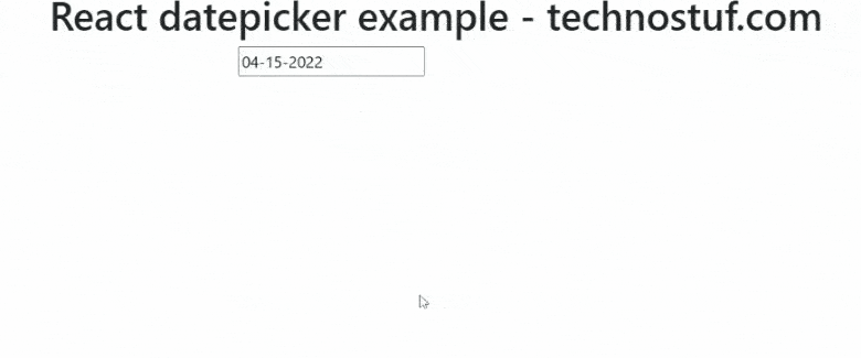
Let’s implement a basic datepicker with minimal settings, Create a new file DatepickerComponent.js which holds the datepicker code, and Add the below code in that file.
import React, { useState } from "react";
import DatePicker from 'react-datepicker';

import "react-datepicker/dist/react-datepicker.css";

const DatepickerComponent = () => {
    const [selectedDate, setSelectedDate] = useState(new Date());

    let handleOnChange = (date) => {
        setSelectedDate(date);
    }

    return (
        <div className="container">
            <div className="row register-form ">
                <h1>React datepicker example - technostuf.com</h1>
                <div className="col-md-6" >
                    <div className="form-group">
                        <DatePicker
                            selected={selectedDate}
                            onChange={handleOnChange}
                            name="startDate"
                            dateFormat="MM-dd-yyyy"
                        />
                    </div>
                </div >
            </div >
        </div>
    )
}
export default DatepickerComponent;
Finally, you have to import DatepickerComponent into App.js.
import './App.css';
import DatepickerComponent from './DatepickerComponent';

function App() {
  return (
    <div className="App">
      <DatepickerComponent />
    </div>
  );
}
export default App;
Run a React application
Run the React application using the following command.
npm startAfter compilation, the program opens your browser and runs http://localhost:3000/
Output
Useful props
- isClearable: Clear the selected date
- selected: Set the selected date in datepicker, Default selected date can be using this property
- dateFormat: Set the date format like dd-mm-yyyy
- closeOnScroll: Accept the boolean value, the default value is false. Datepicker will close on a scroll the page, You can also callback function on scroll, See Example here
- className: Add the custom HTML class
- dayClassName: Add the class to the day’s box in datepicker
- timeClassName: Add the class to the time box in datepicker
- disabled: Disabled the datepicker, Not allowed to select
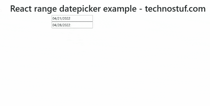
Date Range picker Example
We can select the date range by doubling the date picker component, it allows us to select the date range
import React, { useState } from "react";
import DatePicker from 'react-datepicker';
import "react-datepicker/dist/react-datepicker.css";

const DatepickerRangeComponent = () => {
    const [startDate, setStartDate] = useState(new Date());
    const [endDate, setEndDate] = useState(new Date().setDate(new Date().getDate() + 7));

    return (
        <div className="container">
            <div className="row register-form ">
                <h1>React range datepicker example - technostuf.com</h1>
                <div className="col-md-6" >
                    <div className="form-group">
                        <DatePicker
                            selected={startDate}
                            onChange={(date) => setStartDate(date)}
                            selectsStart
                            startDate={startDate}
                            endDate={endDate}
                        />
                        <DatePicker
                            selected={endDate}
                            onChange={(date) => setEndDate(date)}
                            selectsEnd
                            startDate={startDate}
                            endDate={endDate}
                            minDate={startDate}
                        />
                    </div>
                </div >
            </div >
        </div>
    )
}
export default DatepickerRangeComponent;
Output
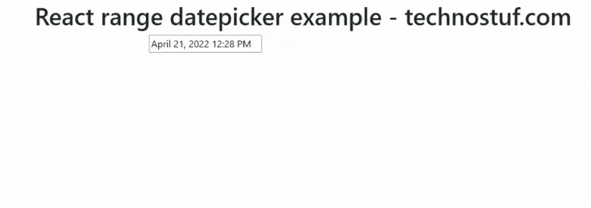
Time picker Example
The time picker allows selecting the time from the time list
import React, { useState } from "react";
import DatePicker from 'react-datepicker';

import "react-datepicker/dist/react-datepicker.css";

const DatepickerTimepickerComponent = () => {
    const [startDate, setSelectedDate] = useState(new Date());
    let handleOnChange = (date) => {
        setSelectedDate(date);
    }
    return (
        <div className="container">
            <div className="row register-form ">
                <h1>React range datepicker example - technostuf.com</h1>
                <div className="col-md-6" >
                    <div className="form-group">
                        <DatePicker
                            selected={startDate}
                            onChange={handleOnChange}
                            showTimeSelect
                            timeFormat="HH:mm"
                            timeIntervals={20}
                            timeCaption="time"
                            dateFormat="MMMM d, yyyy h:mm aa"
                        />
                    </div>
                </div >
            </div >
        </div>
    )
}
export default DatepickerTimepickerComponent;
Output
Datepicker Events
react-datepicker supports the following events
- onSelect: Triggered when selecting the date
- onBlur: Triggered when focus removed from input box
- onFocus: Triggers when focus entered in the input box
- onMonthChange: Triggered when the month change
- onChange: Triggered when input box value changes by selecting the date
- onCalendarClose: Triggered when calendar closed
- onCalendarOpen: Triggerdd when calender open
You can download/clone the working example
https://github.com/technostuf/react-date-picker-example
Related Post
- React Material UI Form example
- React Material UI Autocomplete with getting selected value
- React Area chart using recharts example
- React Pie chart using recharts with legend and custom label
- React google maps draggable marker example
- React datepicker using the most popular react-datepicker library
- React toast notification using react-toastify with example
- React responsive carousel slider with react-slick
- React tooltip using rc-tooltip with example
- React hook form schema validation using yup
I’m not sure where you’re getting your information, but great topic.
I needs to spend some time learning more or understanding more.
Thanks for excellent info I was looking for this information for my mission.
I like looking through a post that will make people think.
Also, many thanks for allowing me to comment!