Material UI is a popular library for UI, Material UI provides many components to build an attractive layout with less effort. In this article, we are going to use React Material UI autocomplete component to create a autocomplete dropdown and also learn how to get the selected dropdown item value.
You can download the working example: https://github.com/technostuf/react-material-autocomplete-example
Create a React application
Create a React app using the below command.
create-react-app react-material-autocomplete-exampleThe above command will create a new folder “react-material-autocomplete-example” so you need to move into that folder, use the below command to change the directory.
cd react-material-autocomplete-exampleInstall Material UI library
After creating react app we need to install react Material UI from npm or yarn.
npm install @mui/material @emotion/react @emotion/styled --saveAdd code to the file
Create an AutoCompleteComponent.js component file to hold the autocomplete code separate from another component and put the below code into that file.
import React, { useState } from "react";
import TextField from '@mui/material/TextField';
import Autocomplete from '@mui/material/Autocomplete';
import Stack from '@mui/material/Stack';
import { Grid } from "@mui/material";

const AutoCompleteComponent = (props) => {
    const itFirms = [
        { title: 'Microsoft Corporation' },
        { title: 'IBM' },
        { title: 'Accenture' },
        { title: 'Oracle' },
        { title: 'SAP' },
        { title: "TCS - Tata Consultancy Services" },
        { title: 'DXC' },
    ];
    const defaultValue = { title: 'DXC' };
    const [value, setValue] = useState(defaultValue);

    const defaultProps = {
        options: itFirms,
        getOptionLabel: (option) => option.title,
    };

    return (
        <>
            <Grid
                container
                spacing={0}
                direction="column"
                alignItems="center"
                justifyContent="center"
                style={{ minHeight: '100vh' }}
            >
                <h1>React material autocomplete - technostuf.com</h1>
                <Stack spacing={1} sx={{ width: 500 }}>
                    <Autocomplete
                        {...defaultProps}
                        id="clear-on-escape"
                        clearOnEscape
                        defaultValue={defaultValue}
                        onChange={(event, newValue) => {
                            console.log(newValue);
                            setValue(newValue);
                        }}
                        renderInput={(params) => (
                            <TextField {...params} label="Select Company" variant="standard" />
                        )}
                    />
                    <p>Selected Country - {value?.title} </p>
                </Stack>
            </Grid>
        </>
    );
}
export default AutoCompleteComponent;
Useful props
clearOnEscape: Selection will be clear on the press escape key
defaultValue: Set the default value of dropdown
onChange: Trigger the event when the user selects the item from the dropdown
disableClearable: Disable clear selection functionality
disabled: Disable the dropdown
Material UI Autocomplete get selected value
As we know autocomplete components have an onChange event, We can get the selected value by using this method
<Autocomplete
                        {...defaultProps}
                        id="clear-on-escape"
                        clearOnEscape
                        defaultValue={defaultValue}
                        onChange={(event, newValue) => {
                            console.log(newValue);
                            setValue(newValue);
                        }}
                        renderInput={(params) => (
                            <TextField {...params} label="Select Company" variant="standard" />
                        )}
                    />
In the above code, in the change event, we can get a selected dropdown item, and set the globally using the useState hook so we can use the selected value in this component.
After adding a code in AutoCompleteComponent, We need to import this file App.js file
import './App.css';
import AutoCompleteComponent from './AutoCompleteComponent';

function App() {
  return (
    <div className="App">
      <AutoCompleteComponent />
    </div>
  );
}

export default App;
Run a React application
Run the React application using the following command.
npm startAfter compilation, the program opens your browser and runs http://localhost:3000/
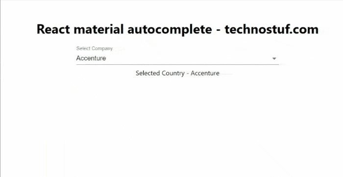
Output
You can download the working example of react material UI autocomplete
https://github.com/technostuf/react-material-autocomplete-example
Related Post
- React Material UI Form example
- React Material UI Autocomplete with getting selected value
- React Area chart using recharts example
- React Pie chart using recharts with legend and custom label
- React google maps draggable marker example
- React datepicker using the most popular react-datepicker library
- React toast notification using react-toastify with example
- React responsive carousel slider with react-slick
- React tooltip using rc-tooltip with example
- React hook form schema validation using yup