Material UI is a popular library for UI, Material UI provides many components to build an attractive layout with less effort. In this article, we are going to demonstrate how to create a basic form using react material UI library. We will use the most used UI components to create a form.
You can download the working example: https://github.com/technostuf/react-material-ui-form
Create a React application
Create a React app using the below command.
create-react-app react-material-ui-formThe above command will create a new folder “react-material-ui-form” so you need to move into that folder, use the below command to change the directory.
cd react-material-ui-formInstall Material UI library
After creating react app we need to install react Material UI from npm or yarn.
 // With npm
 npm install @mui/material @emotion/react @emotion/styled --save

 // With yarn
 yarn add @mui/material @emotion/react @emotion/styled
Add code to the file
Create a MaterialFormComponent.js component file to separate the material UI form code, then we need to import this file into App.js
import React, { useState } from "react";
import {
    FormControl,
    FormLabel,
    RadioGroup,
    Radio,
    FormControlLabel,
    TextField,
    MenuItem,
    Select,
    FormGroup,
    Checkbox,
    Button
} from '@mui/material';
import { Grid } from "@mui/material";

const MaterialFormComponent = (props) => {
    const initialValues = {
        firstName: "",
        lastName: "",
        gender: "male",
        country: "Canada",
        hobby: ""
    };
    const handleInputChange = (e) => {
        const { name, value } = e.target;
        setFormValues({
            ...formValues,
            [name]: value,
        });
    };

    const [formValues, setFormValues] = useState(initialValues);
    const handleSubmit = (event) => {
        event.preventDefault();
        console.log(formValues);
    };

    return (
        <>
            <form onSubmit={handleSubmit}>
                <Grid container alignItems="center" justify="center" direction="column" >
                    <h1>React material ui form - technostuf.com</h1>
                    <Grid item>
                        <TextField
                            id="firstName"
                            name="firstName"
                            label="First name"
                            type="text"
                            value={formValues.firstName}
                            onChange={handleInputChange}
                        />
                    </Grid>
                    <Grid item>
                        <TextField
                            id="lastName"
                            name="lastName"
                            label="Last name"
                            type="text"
                            value={formValues.lastName}
                            onChange={handleInputChange}
                        />
                    </Grid>
                    <Grid item>
                        <FormControl>
                            <FormLabel>Gender</FormLabel>
                            <RadioGroup
                                name="gender"
                                value={formValues.gender}
                                onChange={handleInputChange}
                                row
                            >
                                <FormControlLabel
                                    key="male"
                                    value="male"
                                    control={<Radio size="small" />}
                                    label="Male"
                                />
                                <FormControlLabel
                                    key="female"
                                    value="female"
                                    control={<Radio size="small" />}
                                    label="Female"
                                />
                                <FormControlLabel
                                    key="other"
                                    value="other"
                                    control={<Radio size="small" />}
                                    label="Other"
                                />
                            </RadioGroup>
                        </FormControl>
                    </Grid>

                    <Grid item>
                        <FormControl>
                            <Select
                                name="country"
                                value={formValues.country}
                                onChange={handleInputChange}
                            >
                                <MenuItem key="canada" value="Canada">
                                    Canada
                                </MenuItem>
                                <MenuItem key="japan" value="Japan">
                                    Japan
                                </MenuItem>
                                <MenuItem key="germany " value="Germany">
                                    Germany
                                </MenuItem>
                                <MenuItem key="switzerland " value="Switzerland">
                                    Switzerland
                                </MenuItem>
                                <MenuItem key="australia " value="Australia">
                                    Australia
                                </MenuItem>
                                <MenuItem key="united_states " value="United States">
                                    United States
                                </MenuItem>
                            </Select>
                        </FormControl>
                    </Grid>

                    <Grid item>
                        <FormLabel>Hobby</FormLabel>
                        <FormGroup>
                            <FormControlLabel control={<Checkbox name="hobby" defaultChecked />} label="Writing" />
                            <FormControlLabel control={<Checkbox name="hobby" />} label="Dance" />
                            <FormControlLabel control={<Checkbox name="hobby" />} label="Painting" />
                            <FormControlLabel control={<Checkbox name="hobby" />} label="Video Game" />
                        </FormGroup>
                    </Grid>
                    <Grid item>
                        <Button variant="contained" color="primary" type="submit" style={{
                            backgroundColor: "green",
                            margin: "5px"
                        }}>
                            Submit
                        </Button>

                    </Grid>
                </Grid>
            </form>
        </>
    );
}
export default MaterialFormComponent;
TextField: The TextField component is a complete form control including a label, input, and help text, it supports three variants outlined, filled, and standard.
RadioGroup and Radio: RadioGroup and Radio components are used to together provide a radio button selection to the user.
Select: The Select component is used to collect user information from the list, MenuItem component is used to build menu items or options in the select tag
Checkbox: Checkbox will allow the user to choose one or items from the set, For more detail read the official doc.
After adding a code in MaterialFormComponent, We need to import this file App.js file.
import './App.css';
import MaterialFormComponent from './MaterialFormComponent';

function App() {
  return (
    <div className="App">
      <MaterialFormComponent />
    </div>
  );
}

export default App;
Run a React application
Run the React application using the following command.
npm startAfter compilation, the program opens your browser and runs http://localhost:3000/
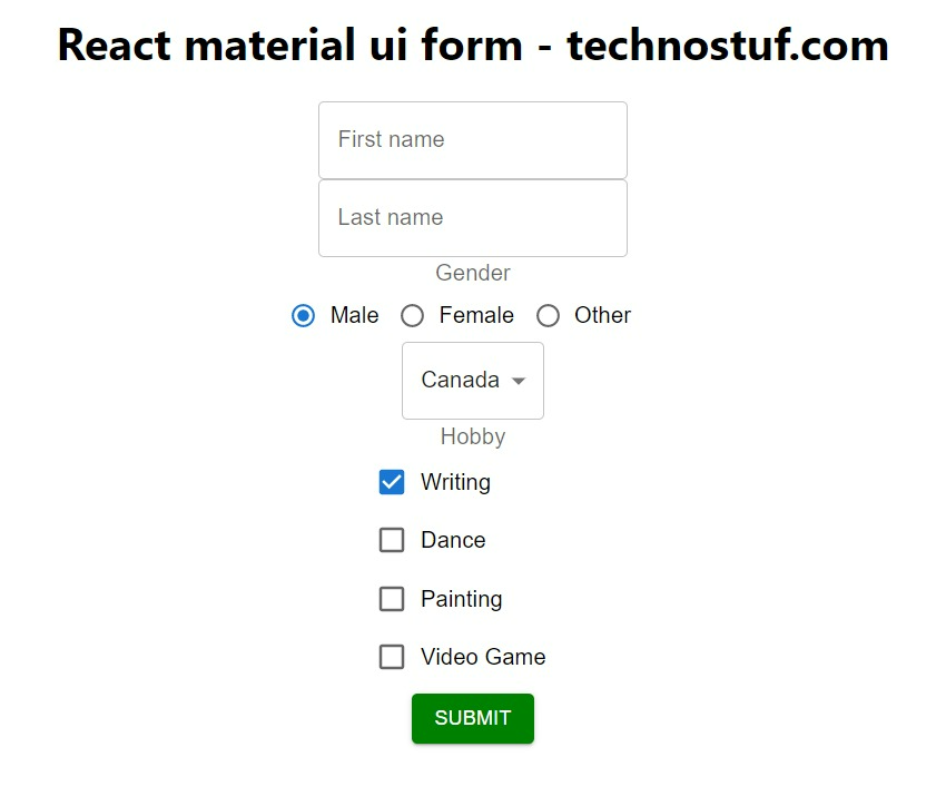
Output
You can download the working example
https://github.com/technostuf/react-material-ui-form
Related Post
- React Material UI Form example
- React Material UI Autocomplete with getting selected value
- React Area chart using recharts example
- React Pie chart using recharts with legend and custom label
- React google maps draggable marker example
- React datepicker using the most popular react-datepicker library
- React toast notification using react-toastify with example
- React responsive carousel slider with react-slick
- React tooltip using rc-tooltip with example
- React hook form schema validation using yup