In this tutorial, we will learn how to add a toast notification using the most popular toast notification package react-toastify, A toast provides a simple notification in a small popup over the content. We can show the toast notification on events like registering users successfully, emails sent, etc… events. Toast message generally comes in different color like success message in the green color, and error message in red color.
You can download the working example: https://github.com/technostuf/react-toastify-example
Create a React application
Create a React app using the below command.
create-react-app react-toastify-exampleThe above command will create a new folder with the app name so you need to move into that folder, use the below command to change the directory.
cd react-toastify-exampleInstall react-toastify library
After creating react app we need to install react-toastify from npm or yarn.
npm i react-toastifyBasic Example
Let’s create a basic example of toast notification, Create a new file NotificationComponent.js which holds the notification code, Add below code in that file
import React from "react";
import { ToastContainer, toast } from 'react-toastify';
import 'react-toastify/dist/ReactToastify.css';
const NotificationComponent = () => {
const showToast = () => {
toast.success("Success message")
};
return (
<div className="container">
<div className="row register-form ">
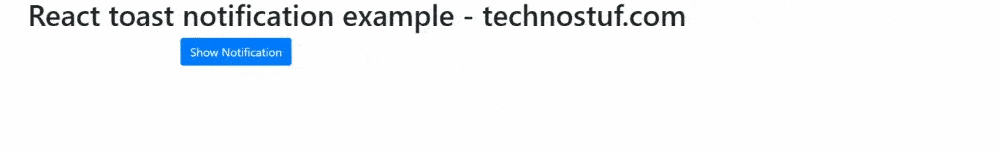
<h1>React toast notification example - technostuf.com</h1>
<div className="col-md-6" >
<button className="btn btn-primary" onClick={showToast}>Show Notification</button>
<ToastContainer />
</div >
</div >
</div>
)
}
export default NotificationComponent;
Finally, you have to import NotificationComponent into App.js.
import './App.css';
import NotificationComponent from './NotificationComponent';
function App() {
  return (
    <div className="App">
      <NotificationComponent />
    </div>
  );
}
export default App;
Run a React application
Run the React application using the following command.
npm startAfter compilation, the program opens your browser and runs http://localhost:3000/
Output
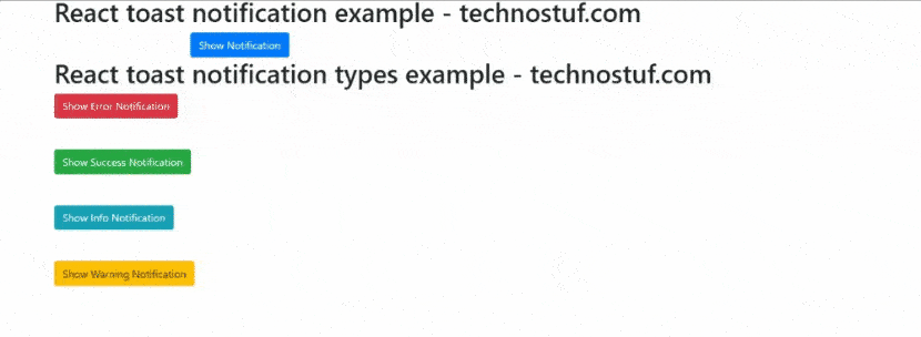
Different types of notification
react-toastify supports 5 types of notification, Success, Warning, Error, Info, and Default are the notification types. Create NotificationTypesComponent.js and add the below code and also import this component file in App.js
import React from "react";
import { ToastContainer, toast } from 'react-toastify';
import 'react-toastify/dist/ReactToastify.css';

const NotificationTypesComponent = () => {
    const showErrorToast = () => {
        toast.error("Error message")
    };
    const showSuccessToast = () => {
        toast.success("Success message")
    };

    const showInfoToast = () => {
        toast.info("Info message")
    };

    const showWarnToast = () => {
        toast.warn("Warning message")
    };

    return (
        <div className="container">
            <div className="row register-form ">
                <h1>React toast notification types example - technostuf.com</h1>
                <div className="col-md-6" >
                    <div className="row mb-5">
                        <button className="btn btn-danger" onClick={showErrorToast}>Show Error Notification</button>
                    </div>
                    <div className="row mb-5">
                        <button className="btn btn-success" onClick={showSuccessToast}>Show Success Notification</button>
                    </div>
                    <div className="row mb-5">
                        <button className="btn btn-info" onClick={showInfoToast}>Show Info Notification </button>
                    </div>
                    <div className="row mb-5">
                        <button className="btn btn-warning" onClick={showWarnToast}>Show Warning Notification</button>
                    </div>
                    <ToastContainer />
                </div >
            </div >
        </div>
    )
}
export default NotificationTypesComponent;
Position of toast
You can change the position of the toast message, currently, it supports 6 types of position, positions are top-left, top-right, top-center, bottom-left, bottom-right, bottom-center, We will use the defined constant for that
- TOP_LEFT
- TOP_RIGHT
- TOP_CENTER
- BOTTOM_LEFT
- BOTTOM_RIGHT
- BOTTOM_CENTER
const showErrorToast = () => {
        toast.error("Error message", {
            position: toast.POSITION.TOP_CENTER
        })
    };
Autoclose toast
Add the autoClose property in the config array, autoClose property accepts the time in ms(Milliseconds)
const showErrorToast = () => {
        toast.error("Error message", {
            position: toast.POSITION.TOP_CENTER,
            autoClose: 2000
        })
    };
You can download/clone the working example of react toast notification
https://github.com/technostuf/react-toastify-example
Related Post
- React Material UI Form example
- React Material UI Autocomplete with getting selected value
- React Area chart using recharts example
- React Pie chart using recharts with legend and custom label
- React google maps draggable marker example
- React datepicker using the most popular react-datepicker library
- React toast notification using react-toastify with example
- React responsive carousel slider with react-slick
- React tooltip using rc-tooltip with example
- React hook form schema validation using yup