Today, We will learn how to implement the tooltip using the rc-tooltip npm package, rc-tooltip is a popular npm package used for adding tooltip on HTML elements. Tooltip requires a child node that supports the on onClick, on mouse enter, etc… events.
You can download the working example of a tooltip component https://github.com/technostuf/react-rc-tooltip-example
Create a React application
Create a React app using the below command.
npx create-react-app react-bootstrap-tooltip-exampleThe above command will create a new folder with the app name so you need to move into that folder, use the below command to change the directory.
cd react-bootstrap-tooltip-exampleInstall rc-tooltip library
After creating react app we need to install rc-tooltip from npm or yarn.
npm i rc-tooltip --saveAdd code to the file
Add tooltip code in the App.js file, For demo purposes, we have added code in the App.js file.
import logo from './logo.svg';
import './App.css';
import Tooltip from 'rc-tooltip';
import 'rc-tooltip/assets/bootstrap_white.css';
function App() {
return (
<div className="App">
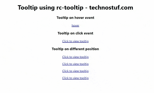
<h1>Tooltip using rc-tooltip - technostuf.com</h1>
<h3>Tooltip on hover event</h3>
<Tooltip placement="left" trigger={['hover']} overlay={<span>Litora tristique, iure, atque repellat rutrum, ultricies labore adipiscing quia.</span>}>
<a href="#">hover</a>
</Tooltip>
<br />
<h3>Tooltip on click event</h3>
<Tooltip placement="left" trigger={['click']} overlay={<span>Corporis do suscipit corporis est turpis ultricies optio maiores accusantium.</span>}>
<a href="#">Click to view tooltip</a>
</Tooltip>
<h3>Tooltip on different position</h3>
<p>
<Tooltip placement="top" overlay={<span>Corporis do suscipit corporis est turpis ultricies optio maiores accusantium.</span>}>
<a href="#">Click to view tooltip</a>
</Tooltip>
</p>
<p>
<Tooltip placement="right" overlay={<span>Corporis do suscipit corporis est turpis ultricies optio maiores accusantium.</span>}>
<a href="#">Click to view tooltip</a>
</Tooltip>
</p>
<p>
<Tooltip placement="bottom" overlay={<span>Corporis do suscipit corporis est turpis ultricies optio maiores accusantium.</span>}>
<a href="#">Click to view tooltip</a>
</Tooltip>
</p>
<p>
<Tooltip placement="leftBottom" overlay={<span>Corporis do suscipit corporis est turpis ultricies optio maiores accusantium.</span>}>
<a href="#">Click to view tooltip</a>
</Tooltip>
</p>
</div>
);
}
export default App;
By default, the tooltip has no style so we need to import rc-tooltip/assets/bootstrap_white.css in our component file.
Useful Props List
- overlayClassName: Additional class name added to tooltip overlay
- trigger: By default value is hover, supports hover, click, focus
- mouseEnterDelay: Default value is 0, number to delay show tooltip when mouse enter
- placement: Supports left, right, top, bottom, topLeft, topRight, bottomLeft, bottomRight
Run a React application
Run the React application using the following command.
npm startAfter compilation, the program opens your browser and runs http://localhost:3000/
Output
You can download the working example of a tooltip component.
https://github.com/technostuf/react-rc-tooltip-example
Related Post
- React Material UI Form example
- React Material UI Autocomplete with getting selected value
- React Area chart using recharts example
- React Pie chart using recharts with legend and custom label
- React google maps draggable marker example
- React datepicker using the most popular react-datepicker library
- React toast notification using react-toastify with example
- React responsive carousel slider with react-slick
- React tooltip using rc-tooltip with example
- React hook form schema validation using yup